I came across an interesting chart in yesterday’s Morning Money tipsheet from Politico that struck me as a something that sounded intuitively correct but was, in fact, not. It’s worth a comment on this blog, which has served as a forum for discussion of jobs numbers throughout the recovery.
Between last week’s BLS employment report and last night’s State of the Union, we’ve heard a lot about impressive job growth in 2015. For my part, I wrote on this blog last week that the 2.6 million jobs created last year makes 2015 the second best calendar-year for job gains of the current recovery.
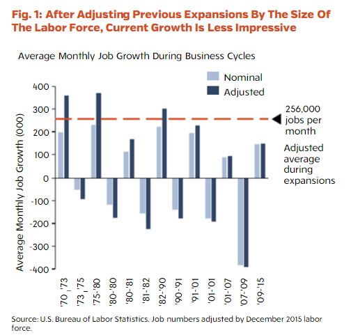
The tipsheet’s “Chart of the Day,” however, suggested that job growth in 2015 was actually lower-than-average if we adjust for the change in the size of the labor force. This is what was in the tipsheet from Politico:
CHART OF THE DAY: NOMINAL JOB GROWTH — Via Hamilton Place Strategies: “Adjusting jobs data to account for labor force shifts can help shed some light on voters’ economic angst, even as we see good headline statistics. … Though 2015 was a good year in terms of job growth during the current recovery and had higher-than-average job growth as compared to recent recoveries, 2015 actually had lower-than-average job growth if we adjust for the change in the size of the labor force.” http://bit.ly/1OnBXSm
I decided to look at the numbers.
The authors propose that we should “scale” reported job gains by the number of workers, which at first seems to make sense. Surely, an increase in monthly employment of 210,000 cannot mean the same thing when there are already 150 million employed people as when there are just 75 million employed people.
But this intuition is subtly wrong for a simple reason: The age structure of the population may also differ in the two situations I have just described. Suppose when there are 75 million employed people, the population of 20-to-64 year-old people is growing 300,000 every month. Suppose also when there are 150 million employed people, the population of 20-to-64 year-olds is shrinking 100,000 per month.
Most informed observers would say that job growth of 210,000 a month is much more impressive under the latter assumptions than it is under the first set of assumptions, even though under the latter assumptions the number of employed people is twice as high as it is under the first assumptions.
BLS estimates show that in the seven years from December 2008-December 2015, the average monthly growth in the 16-to-64 year-old (noninstitutionalized) U.S. population was 85,200 per month. That is the lowest average growth rate of the working-age population going back to at least 1960. Here are the numbers:
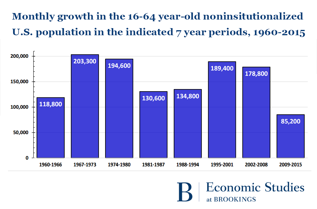
Once we scale the monthly employment gain by the growth in the working-age population, the growth of jobs in recent years has been more impressive—not less—than suggested by the raw monthly totals. Gains in employer payrolls have far surpassed the growth in the number of working-age Americans over the past five years.
Headline writers have been impressed by recent job gains because the job gains have been impressive.


Commentary
Job gains even more impressive than numbers show
January 13, 2016